

How old is It? Clues on Dating Satsuma Wares
By Howard Reed and Richard Cress
Introductory Remarks
The appreciation for Satsuma pottery is not only determined by the quality of the piece itself but also by the date when it was made. As with all pottery and porcelain, determining the exact age of a Satsuma object is not easy. Since most pieces do not carry an actual date or date code (and most of the dates appearing are actually apocryphal), dating has to be inferred from the characteristics of the piece and a knowledge of the history of production of Satsuma.
Most commonly, Western collectors, museums and auction houses date Satsuma ware by what they consider to be the applicable Japanese reign era name (ie Meiji (1868-1912); Taisho (1912-26); early Showa (1926-40); or Showa (1926-89)). At least one museum combines all of Meiji with Taisho (ie 1868-1926).
This is not altogether satisfactory, for two reasons. Firstly, some of these periods are short (eg Taisho) and others are quite long (eg Meiji and Showa). Many important stylistic developments took place during the Meiji period and it is therefore unhelpful to put all Meiji era pieces into a single category. More helpful is to divide Meiji’s 44 years into three – early, mid and late Meiji. Perhaps 1868 -1885 is a reasonable criterion for early Meiji; 1885-1900 for mid-Meiji; and 1895-1912 for late Meiji.
Secondly and more controversially, we know of no reason why Satsuma decorative styles and fashions should change with the end of an emperor’s reign. As is clearly demonstrated on the When Were Satsuma Wares Produced? page, production of Satsuma wares was primarily responsive to major market fluctuations in the West (both increases and decreases in demand).
On that basis, it seems more likely that “late Meiji style” persisted after the change in emperor in 1912, only to be disrupted by a major decrease in European demand shortly after the outbreak of World War I in 1914.
Likewise, “Taisho style” is considered likely to have persisted after 1926 until the Great Depression hit the West in 1929. On this basis, “early Showa style” would date from around 1930 until 1940, when Japan entered World War II.
On this page we suggest a number of characteristics to consider when evaluating the age of Satsuma pottery.

Availability
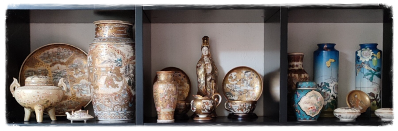
In our opinion, production of nearly all Satsuma ware available now in the West occurred following 1850, with the great preponderance of this production taking place from 1870-1940. Almost all Satsuma work available in Europe or the US is exportware, and therefore dates from the period in which Japan was opened for trade contacts with the West from around 1870.
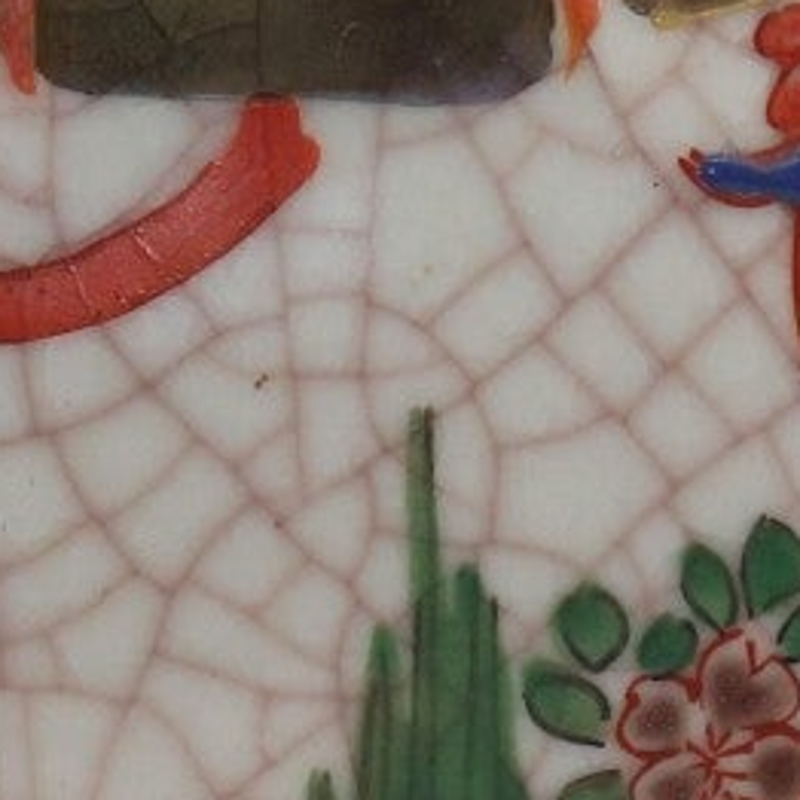
Crackles (Craquelure)
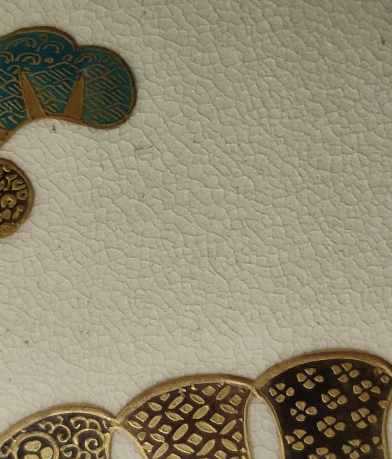

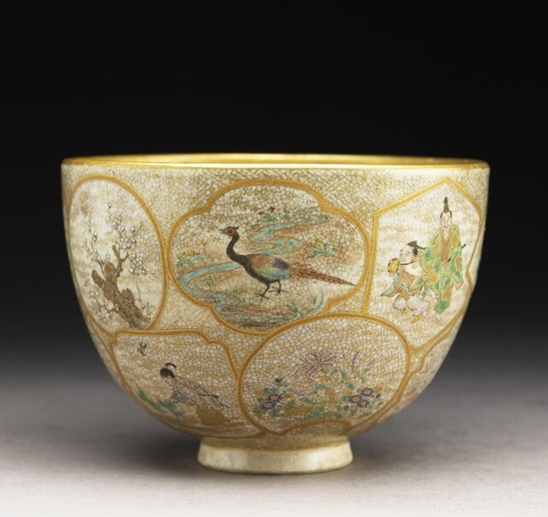
Fine crackles in the glaze are a characteristic of good quality Satsuma pottery, regardless of the age. Sometimes these crackles are so fine that you hardly can see them. Good quality glaze should be pale in colour on a whitish or ivory paste, which gives a pale honey or honey colour to the crackles themselves.
Glaze crackles occur as a natural process after firing Satsuma pottery, as the glaze and underlying body shrink in different ways during the cooling process. Crackle size can be controlled through glaze composition and firing processes, but it takes special skills and experience to fire a piece so that the crackles are very fine and evenly textured.
This is more difficult than simply firing overglaze enamels. For this reason, some Satsuma studios ordered pre-fired glazed and crackled blanks from a good pottery, then decorated it in their own workshop. In such cases, sometimes the name of the pottery will be impressed in the base, as well as the name of the decorator in overglaze enamel.
Good quality ware from the Meiji and Taisho eras can be recognised by the fine density and ivory or honey colour of the crackles. This is a key characteristic of all good Satsuma ware.
Lower quality pottery and newer pieces often have much larger and greyer crackles. They may also have a greyer paste which is not particularly attractive. This is particularly true for many of the lower quality Awata wares, of any age.
Post-War production of cheaper moriage-style Satsuma may have even larger crackles, separated by up to 6 mm. These are often irregular and may be quite grey in colour. The worst examples disturb the overall visual impression instead of being an intrinsic part of the beauty of an object.
A caveat to these general rules is that Kagoshima Satsuma from the Osumi kilns (eg Chosa), tends to have a darker body tint (shading towards buff) and very defined crackles, even for 19th century pieces.[1] These crackles may be much larger (up to 3 mm) and irregular in pattern. They may have a darker tone.
[1] Sandra Andacht (1981); Treasury of Satsuma; Wallace-Homestead; p 38.
Decorative Style and Motifs
One of the keys to properly understanding the age of a piece of Satsuma pottery is recognising the decorative style and motifs employed. While it must always be accepted that some makers (for whatever reason) continued to apply older styles and techniques, it must also be recognised that motifs and decorative styles were subject to buyer demands (ie changes in style and fashion); seller perceptions of what buyers wanted and technological developments in pigments, enamels, use of airbrushes and the like.
There are a number of major shifts in decorative motifs and styles in Satsuma ware in the late 19th century, the early 20th century and the years before and after World War II. These changes can be used for dating purposes. However, most (if not all) of these changes took place in the mainland centres of Satsuma production, rather than in the true home of Satsuma (ie Kagoshima). The following discussion on reign eras only addresses Kyo-Satsuma, which (on this page) is used as a shorthand term for Satsuma ware produced in any of the Honshu ceramic centres (ie, Kyoto, Osaka, Kobe, Yokohama, Tokyo etc). Most of this production was indeed in Kyoto. Kagoshima Satsuma is considered separately, below.
- Early Meiji Era
Decorations in early Meiji imitated those of Kagoshima, which were generally simple representations of nature - birds and flowers (kacho-ga); blossoms with butterflies or other insects, and floral bouquets, set off by surrounding white space and limited nishikide (diaper or brocade) designs. Soon, these were joined by figures of mythical animals, such as the phoenix (ho ho), lion dog (shi shi) and kirin. Human figures drawn from Japanese mythology and history also followed, including various deities and their acolytes (rakan). Decoration often left surrounding white space, like the Kagoshima originals. Clouds of stippled gold dots (‘gold dust’) were commonly used to frame the subject and set off the white space.
Diapers and brocades were commonly simple and often rather sketchily drawn, and commonly used only close to top and bottom rims or to other edges.
Some makers, including Chin Jukan,[2] modelled ornamental figures of Buddhist deities, the seven lucky gods, samurai, rakan, Chinese boys (karako), monkeys, geisha, bijin, etc.
[2] Ibid, pp p 53-54.

Kyoto Satsuma vase with scenes from the story of the warrior Benkei, Mesdag Collection The Hague.
- Mid-Meiji Era
This period saw a large expansion of the focus on figures representing the past glories of Japan – samurai; scholars in discussion (with or without attendants); Chinese boys (karako) playing or dancing; mythological and legendary figures; and various Buddhist and other deities and rakan. The use of major reserves on the front and reverse of vases etc to frame these subjects led to all the space outside the reserves being filled with diapers or brocades. Again, these brocades (eg clove pattern) were commonly reasonably roughly applied.
The use of gold increased, both on moriage outlining and in painted gold features.
Vases, particularly poorer quality Awata ware, began to significantly reflect European tastes in their shapes and applied ornamentation.

Kawasaki Toyama, Meiji period, late 19th century., Sotheby's
- Late Meiji Era
Late Meiji Satsuma saw the peak of detailed and careful decoration, both in figures and brocade diapers. The great majority of the surface (if not the entirety) was usually covered with enamel, wash and gilt decoration. The best decorators (eg Ryozan and Yabu Meizan) developed a very precise and painterly style using very fine brushwork.
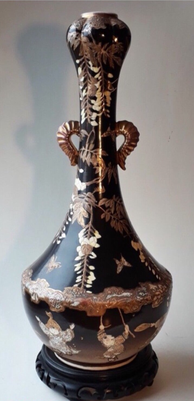
A popular new development was scenes of domestic Japanese life, such as strolling geisha and their attendants; family scenes set in parklands or verandahs; cherry blossom viewing and the like. These were commonly set in large pictorial reserves, surrounded by varied and very detailed diapers. Other popular themes were bijin, traditional processions (perhaps of a daimyo and retainers) and festival scenes.
It is thought that it was Kinkōzan who, in the late 19th century, first applied the imported cobalt blue in a new dark blue glaze. This glaze was a perfect base for detailed gilt brocades and was commonly used as a ground which framed pictorial reserves. This major stylistic development was soon copied by other decorators and became very popular in export markets during late Meiji. Apart from being very attractive, it must also have been much cheaper to produce than the very detailed brocades used by Ryozan, Matsumoto Hozan and others. Kinkōzan also introduced other solid-colour grounds (eg chocolate brown and dark green), but these were not so successful as the deep blue.
Yabu Meizan produced detailed “all-over” floral decoration (millefleur or hanazume) patterns, with each individual flower beautifully rendered.
Gold continued to be a strong stylistic element.
Kinkōzan vase with playing karako's and wisteria on chocolate brown groun.
- Taisho and Early Showa Eras
The Taisho and early Showa eras saw two successive drops in the quality of Kyo-Satsuma, probably driven by the outbreak of World War I and (later) the Great Depression. Mid and lower quality wares predominated.
The popular scenes of domestic life were joined by famous Japanese landscapes, such as Mount Fuji, Lake Biwa and the temples at Nikko. Drawing became increasingly quick and sketchy. The fashion for gilt brocades on dark blue glaze surrounding pictorial reserves continued. However, the gilding was commonly applied using transfers or other printing techniques, rather than being hand drawn. Transfer gilding is much thinner than hand painted gilding and many examples have worn badly over the years.
“All-over” floral patterns became very popular, but in a much-simplified form. They commonly covered the entire piece, except for simple gilt-on-iron red rim borders. They were based on large brushstrokes of colour, usually iron red and pastels. All the definition in these very simple patterns was provided by detailed gilt lines drawn after the enamel firing.
Diapers were commonly reduced to very simple forms, except for narrow rim borders, either gold on iron red, or gold on black.
Tea sets and coffee sets became very popular exports, particularly in the 1920s. These included cup & saucer sets for two, four or six persons; together with a teapot or coffee pot, sugar bowl and milk jug, +/- sandwich plates. Some of these are very good quality. Others are quite average.
Also very popular were the inexpensive Satsuma-style tea sets known colloquially as “dragonware”, due to a moulded dragons forming the spouts and handle of teapots, etc. While earlier, better quality Satsuma dragonware exists (eg late Meiji examples by Hododa), this Taisho style of production involved moriage decoration and porcelain bodies.[3] Sometimes, other animals were modelled, eg elephants.[4]

Sandra Andacht- Plate.235 (L to R) Top row: Tea set dating from the Showa period, just prior to WW II (These sets were also pro duced after the second World War and can be found in orange and green as well as blue. Such sets may also have lithophane cups Second row: Saki bottle dating from the Shoua period, c. 1935 Demitasse set dating from the Showa period, 1935. In all likelihood, the saki cups had lithophane interiors. The demitasse set was also made as coffee sets and tea sets. The motif is of a dragon in gold and red surrounded by red flames. Third rou Juice set con sisting of six tumblers with pearlized luster interiors and an elephant figural juice pot with mahout finial dating from the Taisho period, c. 1930. Third row Vase dating from the Taisho period, c. 1925. Height, 65" (16.31 cm). The dragon is molded in relief, and his head is in protrusion, Cookie jar dating from the Taisho period, c. 1920. Shi Shi handies and finial. Planter in the form of a puppy dating from the Showa period, c. 1935. Height, 5" (127cm)
- Post-War Era
Better quality Kyo-Satsuma wares, eg those produced by Koshida for the tourist market, were decorated with floral bouquets and the like, with simple gold bands on the top rim and simple gilt-on-iron red rim borders (generally like those of Taisho and early Showa). Gold ground could be sprayed and gold lines were commonly used to provide detail within petals and flowers. Some of these pieces are quite good quality, but are seldom recognised as dating from the 1960s-80s.
Poorer quality work used bright moriage enamels; simple, rushed motifs; brassy gilding and an overemphasis on the Satsuma mon.

Koshida Post War tea set.
- Kagoshima Satsuma
Kagoshima Satsuma generally displays the characteristic haku ji yaki paste, very fine crackle and simple motifs of the major Naeshirogawa kilns. Decoration at this time remained mostly simple and delicate representations of nature - birds and flowers (kacho-ga); blossoms with butterflies or other insects, and floral bouquets, set off by white space and bordering nishikide (diaper or brocade) designs. Decorators were careful not to cover the whole body with decoration, in order to better show the beauty of the fine crackled earthenware.

Keizan- modern Kagoshima Satsuma
Enamel Colours
- Late Edo and Early Meiji Era
Enamel colours over this period should be considered in two shorter periods.
Firstly, prior to the progressive adoption of European industrial pigments and enamel technology in the Kyoto ceramics industry (from the early 1870s), enamel colours were restricted to the existing traditional range.
Sandra Andacht (1981) reports that the traditional Kagoshima Satsuma nishikide enamels were crimson (Indian red), gosu blue, turquoise, pale green, black, white and gold (p 39). Kyo-Satsuma also made use of paler colours (commonly as colour washes) such as grey, pale blue, pink, lavender, and salmon (or flesh-colour). It also made greater use of glassy black and dark green enamels and darker iron red or red-brown washes. A traditional yellow glaze also existed (p 53), but appears to have been seldom used on Satsuma.
Enamel colours began to be brighter and cleaner following the introduction of new industrially refined pigments and enamel technologies by the visiting German industrial chemist Gottfried Wagener. As with cloisonne (shippo yaki), these changes became generalised around 1880.
The gold used during this period was commonly quite dull in tone, but attractive in its own right.
- Mid-Meiji Era
As far as is known, the pace of change in enamel colours during mid-Meiji was not significant. The pigments and enamels introduced by Wagener continued in use. More significant changes took place in decorative styles and motifs.
However, many existing enamels were applied as raised dots and lines – moriage technique. Colours include Indian red, black, white and dark green.
Another significant introduction was the use of spray-painted grounds, perhaps in the mid-1880s. Many different colours were used, including sky, bright and deep blues; yellows; greens; cerise; red and lavender.[5] Sometimes, two colours were used, with gradational shading between them. Taizan Yohei IX was the best proponent of this style.
- Late Meiji Era
As in mid-Meiji, the pace of change in enamels during late Meiji was not great. More significant changes took place in decorative styles and motifs.
However, some brighter enamels, including an attractive burnt orange, were in use.
- Taisho and Early Showa Eras
Some cheaper pieces featured the use of strong, glassy moriage enamels. These enamels included pale yellow, dark green, crimson, orange, black, white and gold. These sometimes gauche and hastily applied enamels are generally not appealing to collectors.
Dark-coloured matt backgrounds were used as a means of simplifying decoration and setting off the gold decoration and slip (moriage) enamelling.[6] They include matt dark chocolate brown, matt red-brown and matt black. The black was used in combination with scenes (commonly temples in landscapes) painted purely in gold. These all seem to date to the 1920s and 1930s.
- Post-War Era
The use of strong, glassy moriage enamels continued on some of the poorer quality pieces aimed primarily at the Occupation forces and later US military bases. Gold on these pieces may be glassy and mirror-like.
The higher quality pieces aimed at the developing middle-class tourist market featured strong, clean, bright enamels and colour washes. Lots of gold was included in the decoration, principally as linear overpainting of the design to give it better definition.

Taizan Yohei, Pair of vases with spray-painted ground.

Sandra Andacht, Plate 122 (L to R): Vase dating from the Meiji period, 1890. Height, 91/4" (23.495 cm). The ground is shaded from light to dark purple- lavender (a hue which seems rather rare to find on Satsuma of the Awata School). The motif of flowers and foliage is highlighted and outlined with gilt, as are the outlines of the diapers. Vase dating from the Meiji period, c. 1895. Height, 81/2" (21.59 cm). The body is colored in a cross hue which appears lavender pink. The motif in a central band is that of chrysanthemum heads against a white ground accentuated with gilt jewel- ing. Scattered throughout are mons enameled in red, blue, and gilt on a white ground. The ears are wings with a ring and tassel trim. Pitcher dating from the Meiji period, c. 1888. This is a flat back pitcher, a style copied from Worchester (an English firm). It has a gilt handle with gilt highlights in each of the circular reserves which feature sprays of flowers and foliage. This pitcher is signed Kinkozan.
- Kagoshima Satsuma
The essential colours in the traditional Kagoshima Satsuma palette are crimson (Indian red), gosu blue and gold. While Sandra Andacht (1981) reports that other enamels were also used (ie turquoise, pale green, black and white, p 39), these may or may not be present. If present, they are generally used as highlights. The pale green is a sea green, rather than apple green.
This site has very little reliable information on changes in enamels used on Kagoshima Satsuma during the period of production of Satsuma ware. Most Kagoshima Satsuma sought to remain true to its roots, in terms of both simplicity and open space in the design, and the use of traditional enamel colours. However, some mid and late 20th century wares used small amounts of other enamel colours as highlights, eg purple, green and pink.
Chin Juakn - tea bowl Ashmolean Museum Oxford University

This Satsuma vase evidently was made for the Shimazu family. It is marked on the underside “in the third year of the Kansei Era, the year of boar [1791], Seikun produced this.”
Shimazu Mon
The Shimazu family crest (kamon or, more simply, mon) appears on a large proportion of both traditional Kagoshima Satsuma and Kyo-Satsuma. It usually appears as part of the decorator’s mark on the base, but may also form part of the decoration on the body. This mon, the famous “cross-in-circle”, may be blue, gold, red or (occasionally) black in colour.
The presence or absence of a Shimazu mon tells us little or nothing about the age of a piece of Satsuma ware. Neither does its colour. The colour tells us more about where it was made (see The Beauty of Gosu Blue).


Use of Gold
It is understood that the traditional method of applying gold overglaze on Satsuma involved mixing finely powdered gold (prepared by hand) with an oil-based size. This mixture is painted on after the overglaze enamels are fired (because the temperature required for enamel firing is higher than is appropriate for gilding). The oil burns off during this fourth firing and the gold remains firmly attached to the glaze. This traditional method gives a finely lustrous finish, due to the powdered nature of the gold dust. This finish is not unlike the appearance of the gold lacquer on maki-e lacquerware.
Powdered gold can also be mixed with glass to produce a gold enamel using for jewelling – dots, leaves and petals, etc. Both these techniques were used on traditional Kagoshima Satsuma, as well as on Kyo-Satsuma, throughout production in the 19th century.
However, another technique was commonly used on Kyo-Satsuma, particularly in the period 1880-1900. This involved using slip or enamel trailing in various colours (ie moriage technique) to outline various elements of the design. This was then fixed during the enamel (ie third) firing. The gold/oil mix was then painted over both flat surfaces and these raised outlines. This created the impression of gold enamel, but presumably at a lesser cost.
According to one of the most recent books on Satsuma, [7] in 1899 Kinkōzan invented and applied a new type of liquid gold glaze (水金 mizukane or “water gold”), which was cheaper and had more luster than both the existing oil-based liquid gold and traditional Japanese gold enamel (which had to be polished after firing to make it lustrous).
During the mid-20th century, more modern and very shiny painted gold finishes also became available. It is presumed that this shiny finish was possible because powdered gold was not involved. It may instead have been based on commercially available ceramic finishes based on colloidal gold, which is much finer than powdered gold.
[7] Rinyo Murata (ed) (2015); Satsuma; Kiyomizu Sannenzaka Museum of Art; 168 pages. See p 133.


Use of Marks
- Japanese Marks
Most Japanese marks found on Satsuma ware use kanji characters. It is uncommon to see the simplified characters of the hiragana or katakana alphabets, but they do occur, particularly (but not exclusively) in the early Showa period.
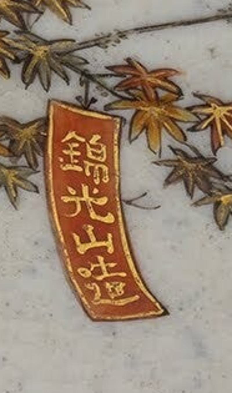
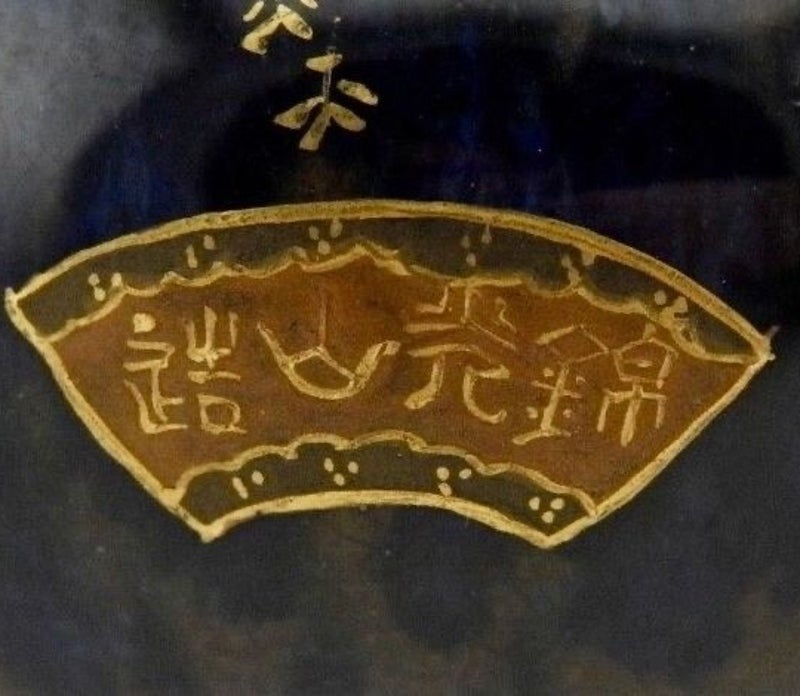
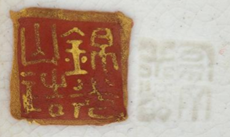
This site has the world’s most extensive and detailed listing of Japanese marks found on Satsuma wares (see Marks and Makers), and the reader is referred to that page for the purposes of translation and any information held regarding the period of production of individual decorators and studios. The following discussion addresses only general matters regarding marks and clues to dating, in particular the absence of marks.
We believe that, in general terms, the older a Satsuma piece is, the less likely it is to carry a maker’s mark. There are exceptions (eg in the case of highly regarded ceramic masters), but it is believed that the inclusion of a decorator’s mark really only began to spread in the 1880s (eg marks for Kinkōzan or Taizan). Over the next 10 years, this became commonplace.
Consequently, most pieces of Kyo-Satsuma made in the early Meiji and mid-Meiji periods (except some of those masquerading as ‘Old Satsuma’) are unsigned and unmarked, whereas most pieces made in the late Meiji period (and later) are marked, and a great number actually bear a decorator’s personal art-name or studio name.
It is less certain when Kagoshima Satsuma began to be marked. However, Gisela Jahn’s Meiji Ceramics (2004) considers (regarding both Kagoshima Satsuma and Kyo-Satsuma) that “Inscriptions on supposed items of pre-Meiji Satsuma should be treated with the utmost caution. … ceramics were not generally signed or stamped unless made for export – and that strongly suggests a date in the Meiji era. The Shimazu mon (family crest) appears on some objects, but its value as a mark of authenticity and age is negligible: more often than not the article in question can be dated on stylistic grounds to the Meiji era, with the mon functioning purely as a decorative motif or as a means of deceiving foreign buyers.” (p 108, emphasis added).
Further, James Bowes, in his book Japanese Pottery (1890) records that: “[Makuzu] Kōzan showed much ingenuity in copying both the pâte and the decoration of the Satsuma potter and some of his works are most difficult to distinguish from the genuine ware as they resemble them alike in faïence, crackle, and in decoration, and his early wares, like them, do not wear any mark or stamp.” (p 116, emphasis added). Clair Pollard’s essay Gorgeous with Glitter and Gold (2006)[8] records that Makuzu Kōzan opened his new workshop in Yokohama in 1870 and immediately “began manufacturing richly decorated stonewares in the style known as Satsuma nishikide (brocade-patterned Satsuma) for the foreign market” (p 133). These latter two authors are suggesting (between them) that Kagoshima Satsuma seldom bore “marks and stamps” prior to sometime well after 1870 (say, circa 1880).
On this basis, it can be suggested that gosu blue Satsuma carrying a decorator’s mark almost certainly postdates 1870 and may postdate 1880. However, it is noted that this is not an established view amongst collectors and experts.
As a general rule, pieces that are only marked “Satsuma” (薩摩 or 薩广) or “Satsuma yaki” (薩摩焼 or 薩广焼) are of lesser quality than those of the same era that bear a decorator’s name or studio name.
Particular mention should be made of the enormous quantities of mid-quality and low quality Awata mantel and floor vases exported to the Wes. These are almost invariably unmarked, except for simple workmen’s marks on the base or footrim to signify the left and right members of a pair (which was very useful during the firing and enamelling processes). This remained the case from the 1870s to the Taisho era.
Occasionally, a mark impressed into the wet paste of the base is found. These are invariably the mark of the pottery which made the blank item, rather than the decorator.
If a potter’s or decorator’s name can be identified on an object, it may be useful to research some biographical details. For example, following the death of Kinkōzan VII in 1927, this major studio closed a few years later (in 1930 or possibly 1932), presumably due to the impact of the Great Depression on Western markets. Satsuma marked for Kinkōzan therefore always dates from before that time.
A further example is found in Taizan Yohei, who closed his Kyoto workshop (which included a pottery) in 1894. Therefore, any piece of Satsuma carrying an impressed Taizan mark was first fired and glazed not later than that date. However, it is understood that Taizan continued decorating on a limited scale, at least to 1901 and possibly until his death in 1922. Thus, works with overglaze Taizan marks (and no impressed mark) may have been created quite a long time after 1894.
This site carries extensive biographical information of some 25 Satsuma and related masters of the Edo, Meiji and Taisho periods (see Masters from Edo, Meiji and Taisho period).
[8] Ellen Conant (ed) (2006); Gorgeous with Glitter and Gold - Miyagawa Kōzan and the Role of Satsuma Export Ware in the Early Meiji Ceramic Industry; Chapter 7 (pp 133-150) of Challenging past and present: the metamorphosis of nineteenth-century Japanese art.


- English Language Marks
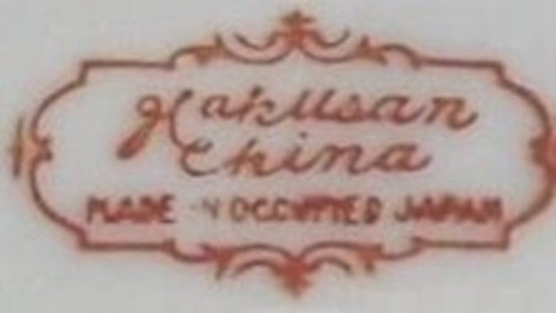
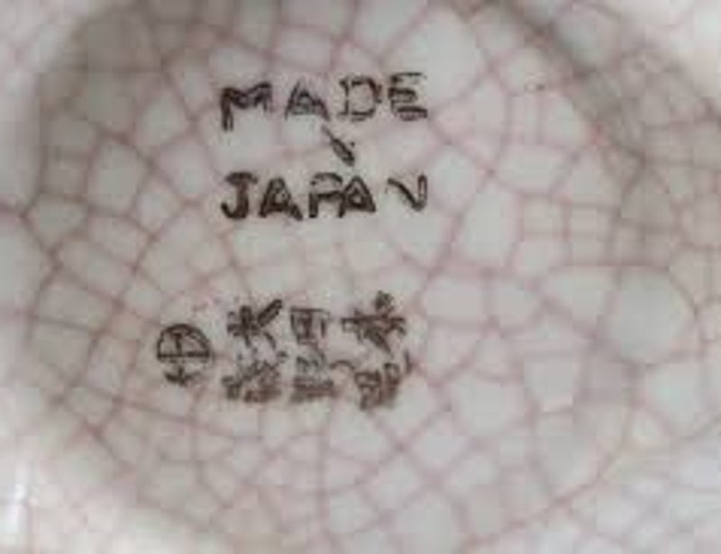
In general, one can say that Western texts are not found on Satsuma pottery made in Meiji or earlier periods. This is despite the passage of the McKinley Tariff Act 1891, which introduced English language “country of origin” labelling for foreign goods imported into the United States.
It is not known why Satsuma ware (as well as Banko earthenware and Imari and similar porcelains) remained unmarked, while all Japanese factory-made porcelain dinnerware, vases and ornaments were stamped “Nippon” or “Made in Nippon” from 1891 to 1920, when the requirement was changed to require “Japan” or “Made in Japan”. The absence of these marks is so universal that it is suggested there must have been some exemption under the Act for “artisanal wares” or the like. However, we have not yet been able to confirm this.
English language marks began to be used during the latter half of the Taisho period. There are known stamped Kinkōzan marks that include either “Nippon” or “Japan” which probably date to the 1920s. In the 1920s, Kinkōzan also used a paper label with the English words “Kinkōzan, Kyoto-Japan”, in addition to the hand-painted kanji studio name. He also used a "Japan" or "Made in Japan" stamp in combination with a painted name in kanji or a stamped name Kinkōzan in English or kanji.[9]
The English words ‘Hand painted’ and “Satsuma” sometimes occur after 1920. Sometimes, these terms are ambiguous. “Hand painted” may mean that only a part was hand painted, but the remainder was printed. “Satsuma” may indicate some broad relationship with Satsuma, rather than a faithful execution. The most obvious example is moriage style painting of deities and rakan on porcelain.
Finally, “Satsuma” in English may indicate nothing more than a recent Chinese production. In particular, the words “HANDPAINTED ROYAL SATSUMA” indicate recent Chinese production, the style, enamels, paste and crackled glaze of which are only vaguely reminiscent of true Satsuma. Beware! But, please note, this is a different mark than “Royal Satsuma Nippon”, which is an authentic trademark used on porcelain produced during the Nippon era.


- Printed Marks
A signature on good quality ware is nearly always hand drawn and not printed or stamped. However, there are exceptions. Kinkōzan for instance used at least two different stamps with English text “Kinkōzan” in the late Taisho period. But as a rule, stamped signatures are only found on pieces of mediocre or poor quality, made in Taisho period or later.

Porcelain Satsuma?
Although true Satsuma pottery is always earthenware and not porcelain, some porcelain ware was decorated in “Satsuma style”. While many of these are poor quality, others are excellent.
Kinkōzan and others occasionally produced high quality porcelain objects, particularly during Taisho and early Showa. Given that porcelain is fired under different conditions, it is quite likely that the blanks were “bought in” and only decorated in-house.
Porcelain is very hard, smooth and white and will never crackle in the same way as the glaze on Satsuma earthenware. Some people like and collect these Satsuma porcelains, but others find that they lack the softness and warmth of the earthenware and crackle glaze, although they may have other artistic qualities, including fine painting.

Kinkōzan porcelain vase.
Conclusion
The foregoing information is provided to enable more precise dating of Satsuma ware by collectors. Nonetheless, it remains difficult (and sometimes impossible) to reliably determine the age of Satsuma to within a time frame of 15-20 years.
Maak jouw eigen website met JouwWeb